|
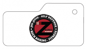
 Keytags often look best when there is less white space around the logo. Round logos are especially tricky to work with because keytags are generally rectangular in shape. Keytags often look best when there is less white space around the logo. Round logos are especially tricky to work with because keytags are generally rectangular in shape.
But there are some tricks to consider that can help make your round logo look more aesthetically pleasing on the keytag. - The first is to consider using a “mini-rectangle” keytag. Mini rectangle keytags are 1″ tall but only 2″ wide, versus standard keytags which are close to 2.5″ wide. Even that small difference in the width can help reduce the white space of the layout.
- You might also consider using a background color on the keytag itself. In the before and after picture below, we’ve done both – we changed to a mini-rectangle and we incorporated the red color from inside the logo onto the keytag itself.
Keep in mind that keytag colors can be any non-fluorescent color on the PMS color chart – so get creative! (click here for the PMS color chart)
|